This is a huge step forward for Blogger, and is something we've been dying to release. Unlike past efforts, this isn't a rigid set of default (ugly) templates which are hard to customize. You get sliders to update the column widths, point and click ability to select the number and location of your columns (some columns even have their own columns! Shiny!), and one-click ability to adjust things like fonts and colors.
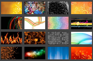
Perhaps the biggest step up is the inclusion of hundreds of free background images licensed from iStockPhoto. We don't support the ability to upload your own (not yet, but on the roadmap), but with some CSS tweaking (which is natively supported in the new template designer by clicking on "advanced | add CSS") you can point to your own image. The images that are already included are beautiful - coupled with font choices, color palette switching and column widths, there are tens of thousands of variants that are available immediately. And did I mention that none of this costs Blogger users a penny?
 |
| Sample iStockPhoto background images |
Very proud of the team who put this together (note: I was a cheerleader on this, can take no credit for the awesome results). Siobhan, Pete, Talin, Sean, Jerry, Noah, David, Wongoo and Jungshik: kudos. If you're a Blogger user, head on over to Blogger in Draft to get started.

Nice new design, Rick! Mine is so customized out already that I will need to take a bit of time before jumping in. But love the announcement.
ReplyDeleteThanks, Louis! Yeah, we're already thinking about how to get highly-tweaked designs incorporated into the layout editor. As you might imagine, CSS can get butchered, making it tricky (to say the least) to know what went where and how that maps to the defaults... but we're looking at it.
ReplyDeleteI must say that the new templates look great. I'm already considering switching to layouts, but it's not easy to migrate customized templates.
ReplyDeleteYou should allow users to submit templates and add a gallery where you can rate templates.
@Alex - yes, a user-submitted gallery is something we are eager to support. Glad you like them, and you'll be much happier on Layouts when you switch. :)
ReplyDeleteWOW! I knew something was up when I saw your site come up on a Rounders template yesterday. This is absolutely great!
ReplyDeleteExcellent work. So easy.
ReplyDeleteThank you
ReplyDelete